
Nexus Inclusion
Nexus Inclusion
UX Design
Product
Motion
2025
Nexus Inclusion is a digital product built to help organisations measure, improve and manage the accessibility of their products and websites.
I worked across product, website UX and motion design to help shape the product from the ground up, creating an experience that felt clear, credible and easy to use.
The brand and visual design for this project were completed by Duncan Menzies. Following project completion, I also redesigned the logo at the client's request to further differentiate the brand's identity from potential competitors.

Overview
Many organisations want to build more inclusive tools and comply with accessibility legislation, but often lack the structure, data, or tools to meet the necessary accessibility standards. Nexus Inclusion was created to solve that problem. The platform gives teams a clearer view of where they are today, helps them identify areas for improvement, and supports ongoing progress through tools, guidance, and reporting.
As a new product, the challenge was not redesigning an existing experience but defining, designing and marketing one from scratch. That meant shaping how the product should work, and ensuring that trust if built with users and customers from day one. My role focused on turning a complex and technical product proposition into something that felt approachable, practical, and easy to adopt.
My approach focused on auditing first and then improving the new MVP product that prioritised key value adding features and usability.
Discovery – Identified usability issues and accessibility barriers within the original Microsoft prototype.
Design thinking – Defined key users and goals through founder workshops, resulting in three proto-personas.
Wireframing & UX design – Developed responsive layouts for desktop, tablet, and pitch-side use.
UI design – Built a dark-mode interface optimised for clarity, accessibility, and data visualisation.
My Contribution
Needs analysis and product requirements documentation
Information architecture design
Product strategy
Product design
UX design
Motion design & animation

Discovery & needs analysis
Before defining features or the interface direction, the first step was to understand the problem space, audience needs and the commercial opportunity. Because Nexus Inclusion was a new product, this phase focused on identifying the struggles of target customers and on marrying Nexus Inclusion's mission and user needs to identify a suite of prioritised features for the product. The discovery and needs analysis covered the following:
Competitor and market review of existing accessibility focused tools.
Identifying common gaps and potential opportunities for new product development.
Establishing what user expectations might look like for the product.
And lastly, identifying any opportunities to simplify a complex topic, as this was a new product and was free of any legacy redundancies or bloated feature creep that is so common within established products.
My approach focused on auditing first and then improving the new MVP product that prioritised key value adding features and usability.
Discovery – Identified usability issues and accessibility barriers within the original Microsoft prototype.
Design thinking – Defined key users and goals through founder workshops, resulting in three proto-personas.
Wireframing & UX design – Developed responsive layouts for desktop, tablet, and pitch-side use.
UI design – Built a dark-mode interface optimised for clarity, accessibility, and data visualisation.

Product Requirements Documentation
Following the first phase of the project, I translated insights into clear product requirements to help move Nexus Inclusion from concept to delivery.
I created feature documentation covering user needs, MVP priorities, functional requirements, reporting needs and future opportunities. For key modules, this included user stories, use cases, success measures and the functionality needed for development.
This process fostered early stakeholder alignment, reduced ambiguity, and ensured the product was practical, purposeful and ready to scale.
Explainer video
To help sell the value proposition of Nexus Inclusion, I created an animated explainer video that was used on the marketing website's homepage to quickly give users an overview of the product and all it could help them achieve. This was produced before the product design commenced, and was picked up early on alongside an early MVP version of the website homepage. This helped the Nexus Inclusion team establish customer interest and intent early on before investing in product development. This approach helped improve the product's ultimate commercial viability.
I've included it here in the case study so you too can get an overview quickly and easily of the vision, mission and promise of the product. The video has a voiceover, so please turn on your sound when playing.
My approach focused on auditing first and then improving the new MVP product that prioritised key value adding features and usability.
Discovery – Identified usability issues and accessibility barriers within the original Microsoft prototype.
Design thinking – Defined key users and goals through founder workshops, resulting in three proto-personas.
Wireframing & UX design – Developed responsive layouts for desktop, tablet, and pitch-side use.
UI design – Built a dark-mode interface optimised for clarity, accessibility, and data visualisation.
Product design
The product is organised as a workspace with five clear jobs. I designed these flows as a set of wireframes, using a library of reusable components to ensure efficient development and reduce the UI design time required to deliver. The five jobs were:
Scanning for accessibility issues
Ongoing automated scanning and maintenance
Reviewing issues and managing tasks
Learning how to make fixes
Managing multiple products, projects, and websites through one account
In addition to the above, there were other, more granular flows and more generic flows that you would see in many similar products.
My approach focused on auditing first and then improving the new MVP product that prioritised key value adding features and usability.
Discovery – Identified usability issues and accessibility barriers within the original Microsoft prototype.
Design thinking – Defined key users and goals through founder workshops, resulting in three proto-personas.
Wireframing & UX design – Developed responsive layouts for desktop, tablet, and pitch-side use.
UI design – Built a dark-mode interface optimised for clarity, accessibility, and data visualisation.

Home dashboard
The homepage dashboard was designed to give both new and returning users a clear view of their workspace and provide quick and easy access to key tools and the ability to pick up any tasks they had previously left off. A key focus of the client was to ensure that their product was also highly accessible itself, so careful attention was paid throughout the design process to ensure that semantically everything met the highest of standards.
Scanning was the most important feature that was prioritised, as it was where the most value was seen in the product. Following this, managing tasks and projects were also included, and lastly, there was a section dedicated to encouraging the user to revisit the suite of education resources and learning pathways.
My approach focused on auditing first and then improving the new MVP product that prioritised key value adding features and usability.
Discovery – Identified usability issues and accessibility barriers within the original Microsoft prototype.
Design thinking – Defined key users and goals through founder workshops, resulting in three proto-personas.
Wireframing & UX design – Developed responsive layouts for desktop, tablet, and pitch-side use.
UI design – Built a dark-mode interface optimised for clarity, accessibility, and data visualisation.

Scan feature
Users can scan a URL, an uploaded file, media, Figma links or code. Scan settings let them define depth, devices and compliance targets such as WCAG. Recurring scans can be scheduled for monitoring.
Scan results are grouped by priority, disability type, asset type and fix type. Each issue has a description, a fix and a retest action. This is designed to reduce handover time between content, dev and QA.
Scans could be triggered from numerous locations within the product, so all new scans were configured within a modal window, and once set up and running, could be revisited via the scans page or notification centre once complete.
My approach focused on auditing first and then improving the new MVP product that prioritised key value adding features and usability.
Discovery – Identified usability issues and accessibility barriers within the original Microsoft prototype.
Design thinking – Defined key users and goals through founder workshops, resulting in three proto-personas.
Wireframing & UX design – Developed responsive layouts for desktop, tablet, and pitch-side use.
UI design – Built a dark-mode interface optimised for clarity, accessibility, and data visualisation.


Review issues and manage tasks
A task's view lets teams see what was found, what is urgent and who owns it. Notifications and weekly reports keep people in the loop. This was important to make the platform useful beyond scanning and auditing and bring the user along the pathway to compliance.
A key consideration was to produce a design that felt digestible to less technical users who might use a backlog of tasks generated from a scan to advocate for resources, as well as to highlight the positive work they were doing to improve accessibility. With this in mind, progressive disclosure was a key design decision to ensure the feature worked for both less technical staff and allowed more technical staff, such as developers, to drill down into the details of an issue that needed resolution. To make the lists more tangible to less technical staff, each task is assigned to a POUR principle, colour and a clear level of urgency.
Within each task are details on how to resolve it, clear checklist steps, and, where possible, the option to implement a quick fix. Generative AI was built into the product to achieve this alongside manual guidance based on accessibility guidelines such as WCAG.
My approach focused on auditing first and then improving the new MVP product that prioritised key value adding features and usability.
Discovery – Identified usability issues and accessibility barriers within the original Microsoft prototype.
Design thinking – Defined key users and goals through founder workshops, resulting in three proto-personas.
Wireframing & UX design – Developed responsive layouts for desktop, tablet, and pitch-side use.
UI design – Built a dark-mode interface optimised for clarity, accessibility, and data visualisation.

Learning how to make fixes
The Learn area reuses the same layout to deliver WCAG explained, compliance guides, developer guides and certificates so teams can upskill inside the tool. This was a key differentiator we added after the initial needs analysis and was a particular area that stakeholders felt very strongly about, as a large part of their mission was to educate people and, as much as possible, improve accessibility by providing a platform and space for learning as well as working.
My approach focused on auditing first and then improving the new MVP product that prioritised key value adding features and usability.
Discovery – Identified usability issues and accessibility barriers within the original Microsoft prototype.
Design thinking – Defined key users and goals through founder workshops, resulting in three proto-personas.
Wireframing & UX design – Developed responsive layouts for desktop, tablet, and pitch-side use.
UI design – Built a dark-mode interface optimised for clarity, accessibility, and data visualisation.

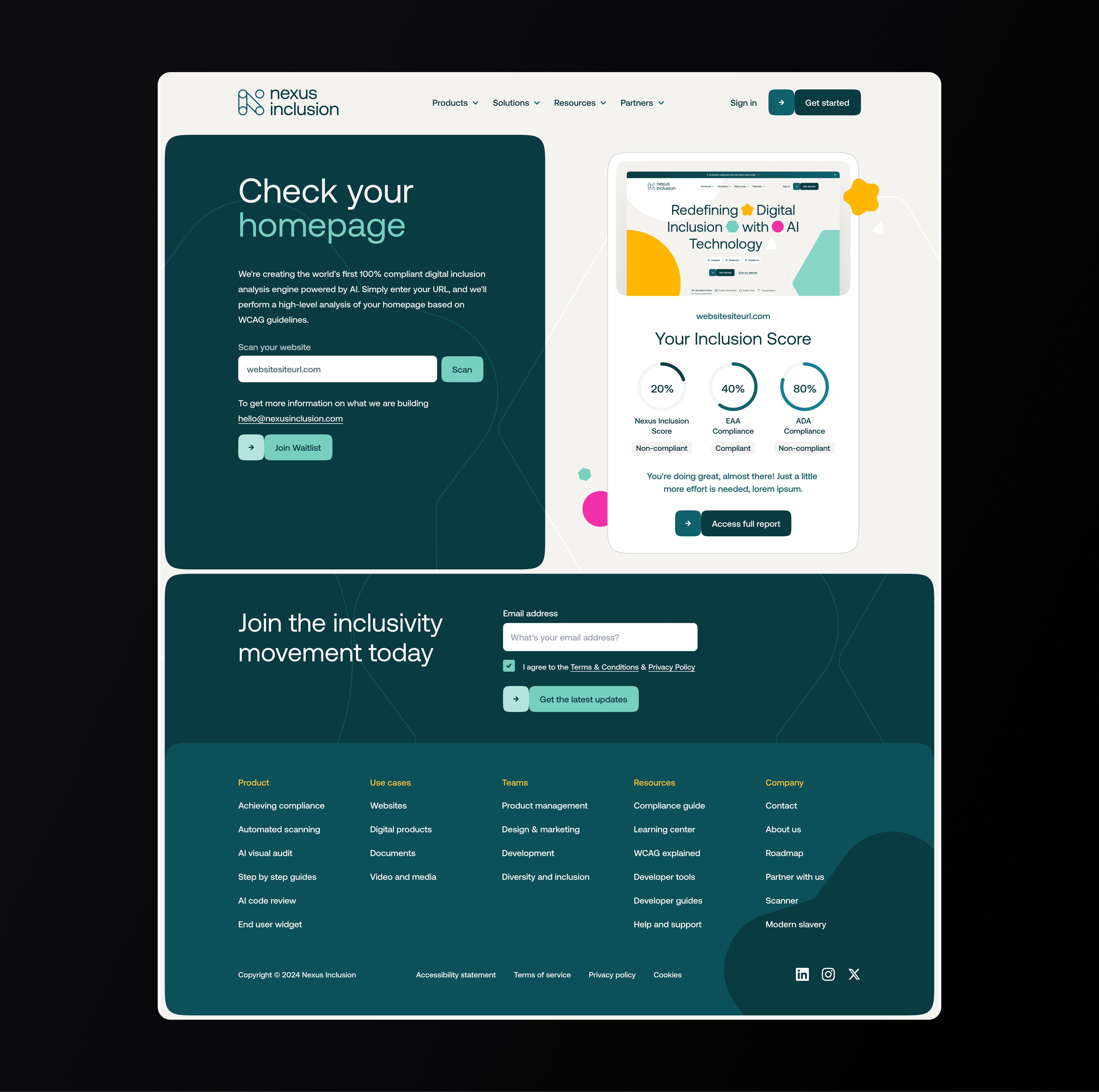
Marketing website
The website was designed primarily with lead generation in mind. The homepage was oriented to first-time users who knew little of the product and needed a quick but comprehensive overview of how the product worked, its relevance and how it could help them with their specific set of challenges.
The sitemap breaks into Product, Solutions, Resources and Partners. Product holds the core features such as automated scanning, AI visual audit, step-by-step guides, AI code review and the end-user widget. Solutions reframes the same offer for websites, digital products, documents and video and media to help teams understand the tools' relevance. Resources include compliance guides, a learning centre, a blog, WCAG explained, developer tools and support.
The full site was designed to be highly modular and flexible, allowing for rapid iteration of landing pages, solution pages and product pages so that the marketing team could refine the website over time, and create campaign-specific landing pages as required.
My approach focused on auditing first and then improving the new MVP product that prioritised key value adding features and usability.
Discovery – Identified usability issues and accessibility barriers within the original Microsoft prototype.
Design thinking – Defined key users and goals through founder workshops, resulting in three proto-personas.
Wireframing & UX design – Developed responsive layouts for desktop, tablet, and pitch-side use.
UI design – Built a dark-mode interface optimised for clarity, accessibility, and data visualisation.


Free scan
A free scan was added to provide a softer inroad to conversion and to demonstrate the product's benefits and potential.
My approach focused on auditing first and then improving the new MVP product that prioritised key value adding features and usability.
Discovery – Identified usability issues and accessibility barriers within the original Microsoft prototype.
Design thinking – Defined key users and goals through founder workshops, resulting in three proto-personas.
Wireframing & UX design – Developed responsive layouts for desktop, tablet, and pitch-side use.
UI design – Built a dark-mode interface optimised for clarity, accessibility, and data visualisation.
Pricing Page
At a later stage, a new pricing page was created to help potential customers understand the product offer quickly and compare plans with confidence. I focused on creating a clear structure that balanced transparency with conversion, including pricing tiers, feature comparisons, optional add-ons and common questions. Strong calls to action were placed throughout the page to encourage users to book a demo or speak with sales. The goal was to reduce hesitation, build trust and turn interest into qualified leads. The pricing page rolled out in phases and does not yet fully reflect the updates below.
My approach focused on auditing first and then improving the new MVP product that prioritised key value adding features and usability.
Discovery – Identified usability issues and accessibility barriers within the original Microsoft prototype.
Design thinking – Defined key users and goals through founder workshops, resulting in three proto-personas.
Wireframing & UX design – Developed responsive layouts for desktop, tablet, and pitch-side use.
UI design – Built a dark-mode interface optimised for clarity, accessibility, and data visualisation.

Outcome
Nexus Inclusion was a chance to help build a product from the ground up around a meaningful challenge. My role covered product thinking, UX, feature planning and helping shape a clear experience around a complex topic.
It showed how valuable strong design can be early on. creating clarity, building confidence and giving a new product a solid foundation to grow from.
My approach focused on auditing first and then improving the new MVP product that prioritised key value adding features and usability.
Discovery – Identified usability issues and accessibility barriers within the original Microsoft prototype.
Design thinking – Defined key users and goals through founder workshops, resulting in three proto-personas.
Wireframing & UX design – Developed responsive layouts for desktop, tablet, and pitch-side use.
UI design – Built a dark-mode interface optimised for clarity, accessibility, and data visualisation.
Other projects
Projects

